COMPANY
VISION STATEMENT

VISION STATEMENT
KISEKI’s Philosophy
Creating Happiness for People
Creating Happiness for People
MISSION
Improving the health of both mind
and body through Japan quality
medical cannabis
Making People's Minds and Bodies healthier
with Japan Quality Medical Cannabis
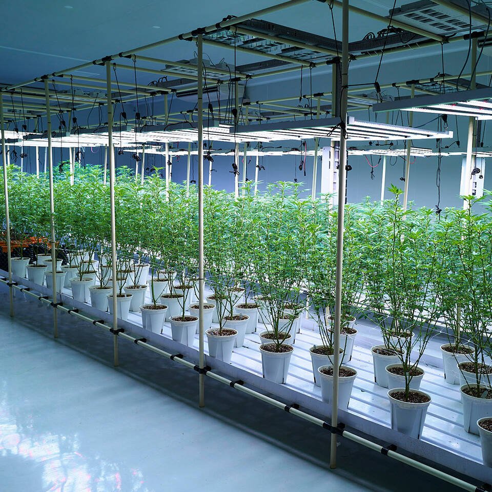
by Utilizing Sustainable Plant Factory Technology.
VISION
Japan’s Leading
Medical Cannabis Company
Be the Japan’s Leading Medical Cannabis Company
SLOGAN
Save the World
with Medical Cannabis
Save the World with Medical Cannabis
VALUE
“Genki” (Vitality):
We work with vitality, staying honest, kind, cheerful, and healthy both in mind and body—without succumbing to anger, fear, or sadness.
Gratitude:
We express our gratitude with both actions and words, never forgetting to thank our colleagues, customers, partners, shareholders, and everyone involved with KISEKI.
All for One:
We trust ourselves and our team, gather talent from far and wide, seek knowledge globally, and unite across all levels to achieve success together.
Resilience:
For our customers, society, and the greater good, we face challenges with high aspirations and courage, pushing through difficulties without fear of failure, and seeing every task through to the end.
Pioneer:
We respond swiftly and diplomatically to changes in the world, constantly creating new value as pioneers in the industry.

LOGO MARK OF KISEKI
Flower of Life (Sacred Geometry)
The Flower of Life, a sacred geometric pattern, has been used across cultures worldwide since ancient times. With its harmonious balance based on the golden ratio, it is considered the ultimate form that encompasses all living things—a representation of the universe itself and the fundamental pattern underlying all existence.
Hemp Leaf Pattern
In Japan, the “Hemp Leaf Pattern” has long been regarded as sacred. Known for its rapid growth and versatile capabilities, hemp was believed to have protective powers against evil spirits. This traditional Japanese design has been used on newborns’ clothing to symbolize protection and growth since ancient times.
Japan Quality
“Wa” - Japanese Essence - is represented by the circle and the deep crimson color. Symbolizing the rising sun, this traditional Japanese color also represents benevolence and vitality. We adopt this crimson as the core of our corporate color, proudly showcasing our brand as a symbol of Japanese quality to the world.

CONTACT
For inquiries, please contact us.